My Role
UI design, user research, prototyping
Establishing a design system
Logo and brand design
Challenges
Maximize the amount of screen visible to view art
Gain new and repeat clients
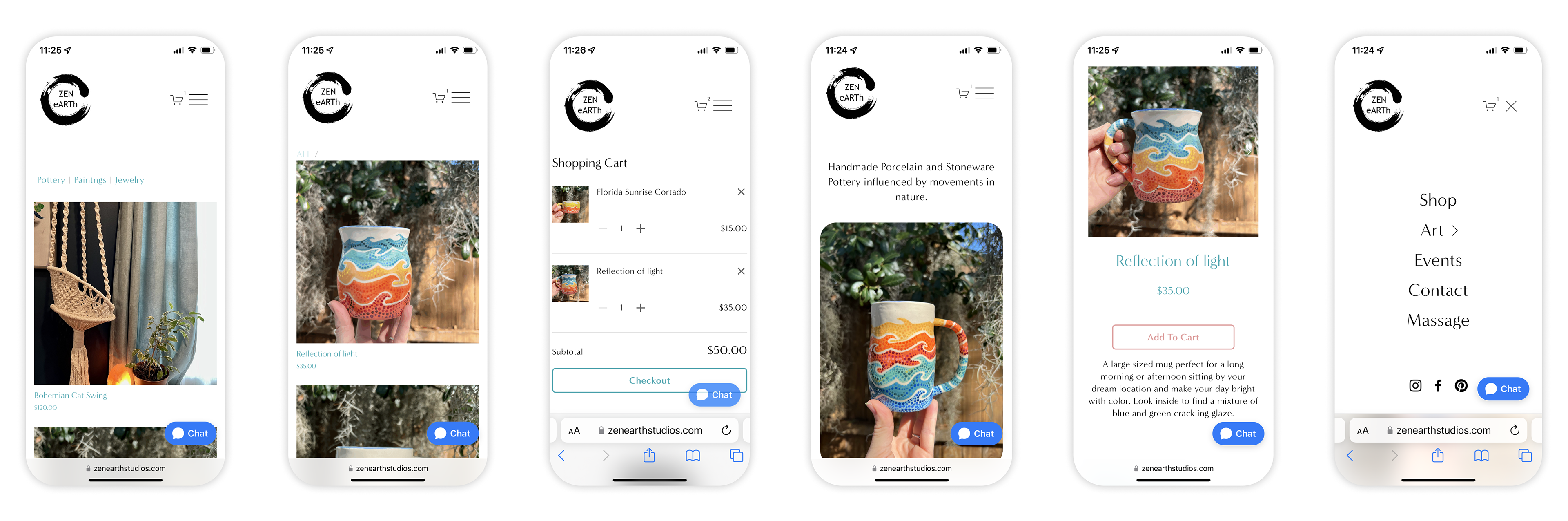
Redesign the checkout process
Problems
- The logo needs to be redesigned so it is easier to read and can be used as a stamp on pottery.
- Breadcrumbs should be present and consistent.
- Create a hierarchy with visual elements, images, and typography.
- Icons, buttons, and cards should reflect art design and have more color and curved elements.
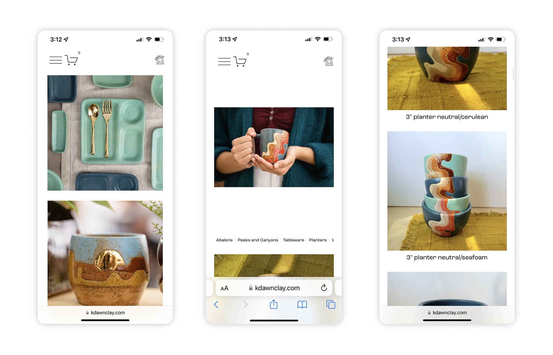
Competitive Analysis
Now that I identified the problems, I wanted to see if my competitors were also having similar issues.
While researching K Dawn Clay's mobile website I found:
- The logo is a great design but too small to recognize.
- No color scheme for branding.
- There are no buttons or clickable images on the landing page.
- Categories on pages are too small to read.
- Spacing and sizing are inconsistent.
Discovering my target market.
I was inspired to think of new ideas by discovering what Susan (persona) really needed. Susan needs larger text, images, and buttons on a mobile platform because she is typically on the go and rarely sits at the computer. Susan likes to share finds with family and friends who do use the computer.
Bio
She loves going out with her friends and family. She likes finding new things for her home and supporting local businesses. She shops at Farmers Markets on the weekends and likes buying gifts for others.
Demographic
55-year-old, female, located in Overland Park, Kansas, married, and a teacher.
Goals
Having an enjoyable, colorful home, creating something new, time with family and friends, and feeling accomplished.
Frustrations
Using bifocal glasses, developing arthritis, doesn’t understand new terms, and communicating through text.
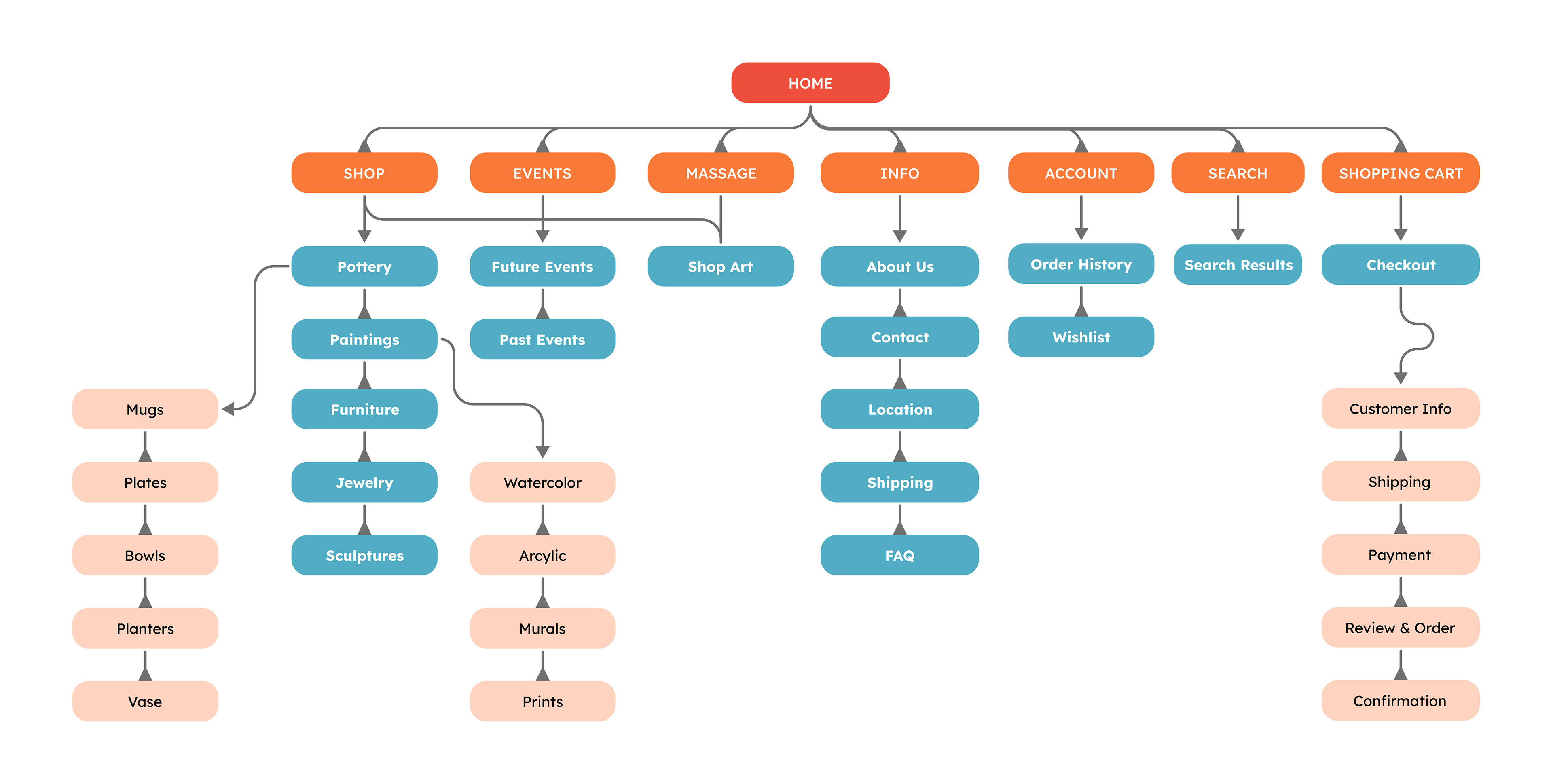
Information Architecture
I constructed the information architecture to get an idea of what screens I needed to build and an idea of how the user would flow.
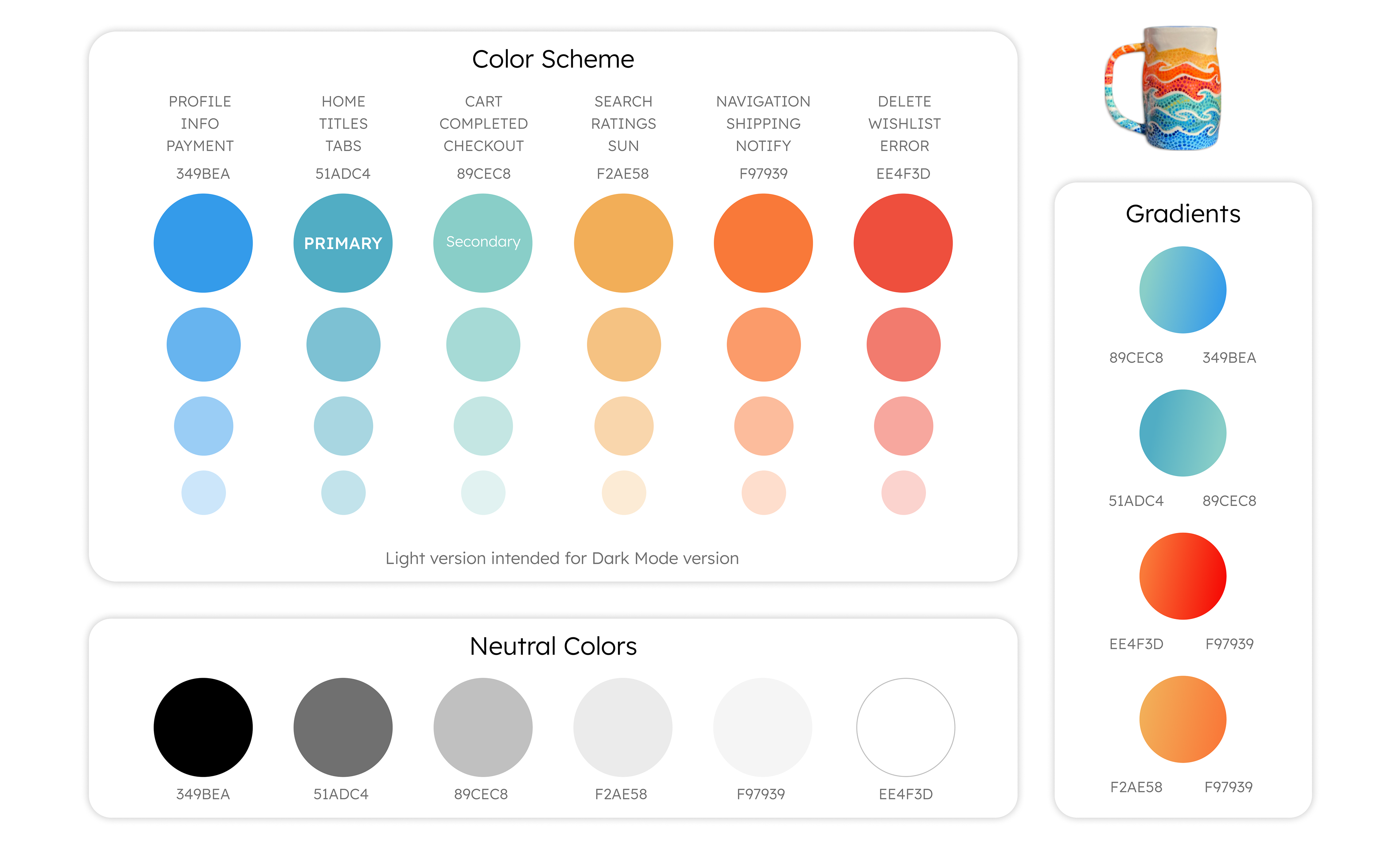
Zen Branding
I based the color scheme for the website on my pottery designs. Through color psychology, I adapted each color to different actions within the website. This helps inform and encourage the user to make a sale or discover more art.
Typography
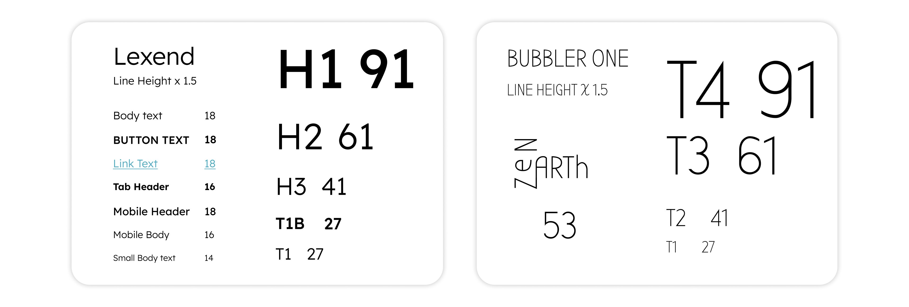
I choose Lexend for my main typography because it has appealing curves and it has a perfect circle for the O. For the logo and art titles, I went with Bubbler One typography because it has curved edges, with crisp lines that feel dramatic and edgy.
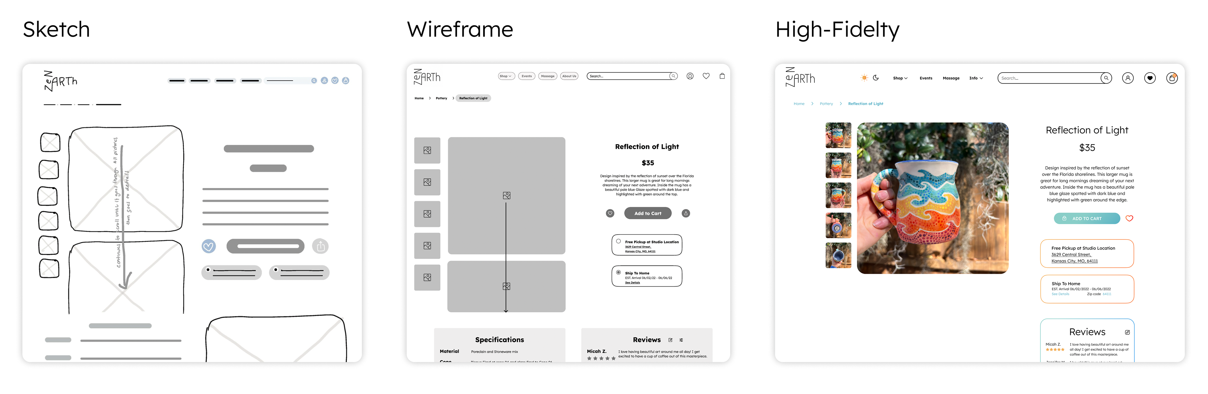
Sketching
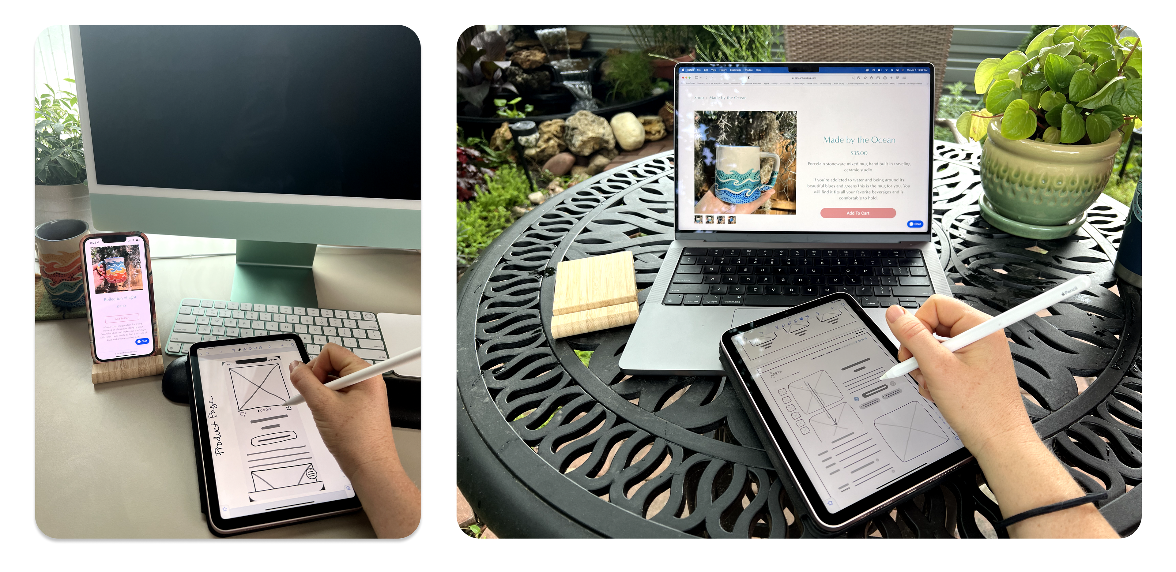
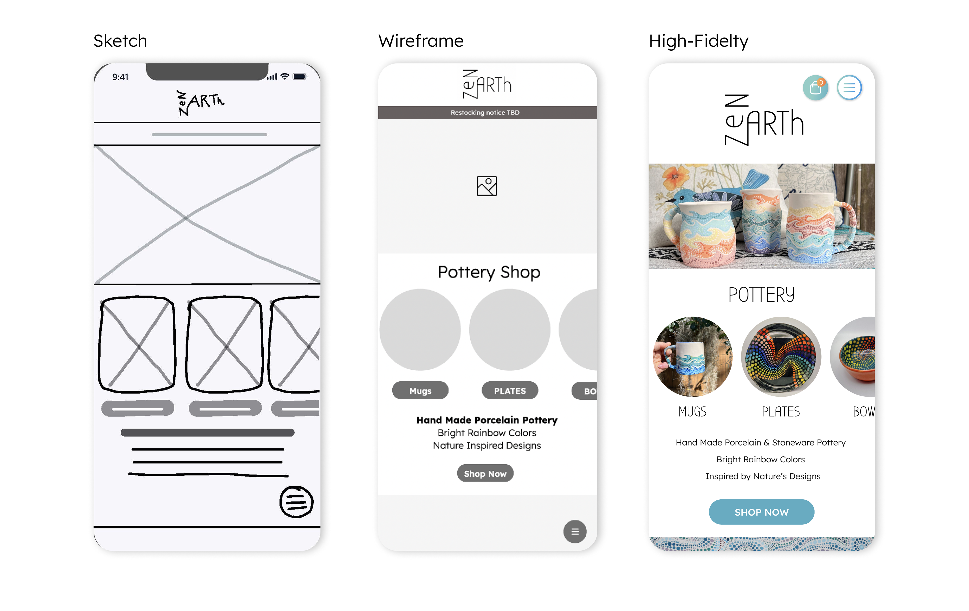
As an artist, I love drawing by hand and the iPad brings it to a whole new level. I can make the website sketches in half the time by copying elements that I have already drawn. I find the notability app the easiest so far but I am always researching new ideas and technology.
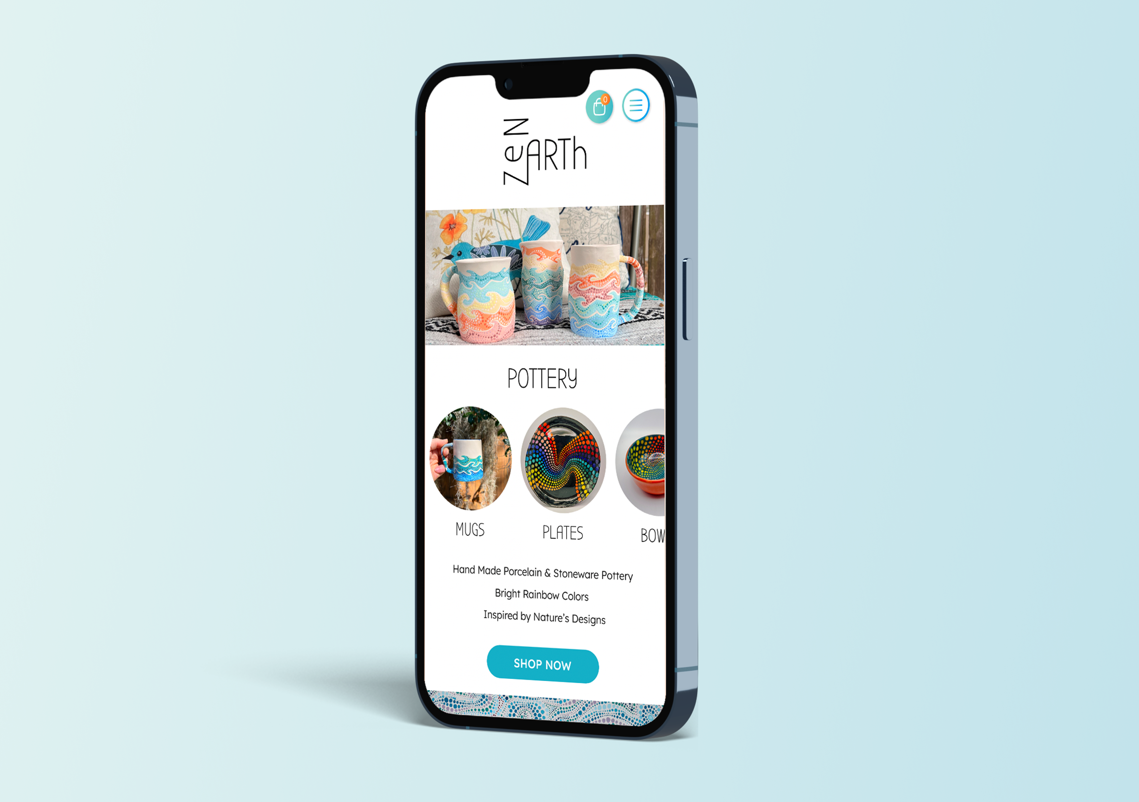
Time to design a solution!
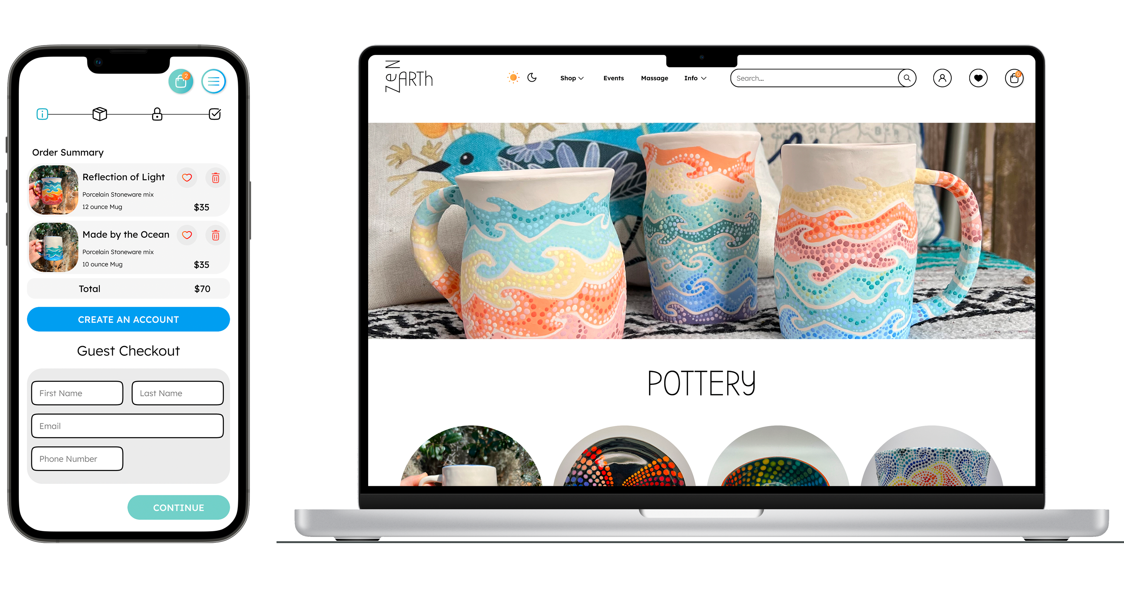
By sketching first, I could get my ideas out quickly and start narrowing down what needed to be on each page. Once I established my content, I could move into Figma and start doing basic black and white images and UI elements to figure out my spacing and hierarchy. I went through several variations before I felt that more content and colors would start adding visual weight and give me a better understanding of how it should be. My final product to the right is now ready to be prototyped.
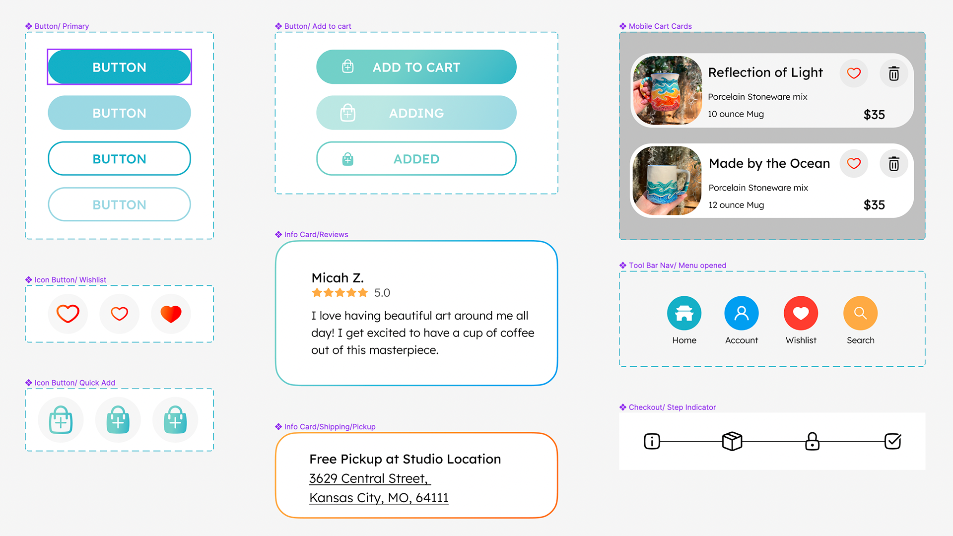
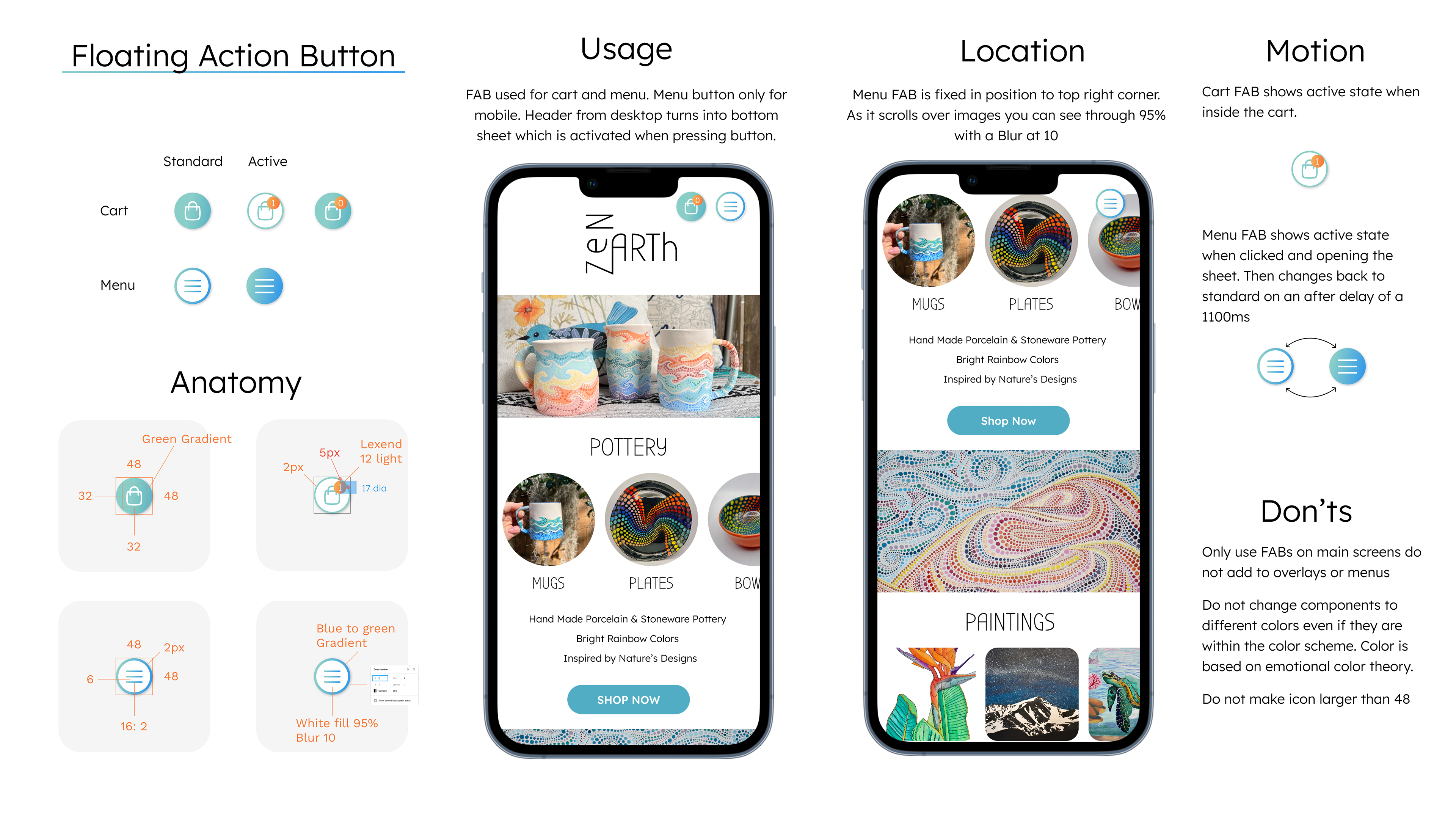
Components & Design System
Where color, typography and visual elements join forces!
I was able to create a consistent design throughout my process by building components in the early stages of design. When I began documenting them into a design system, I was able to hone in on their alignment and structure.
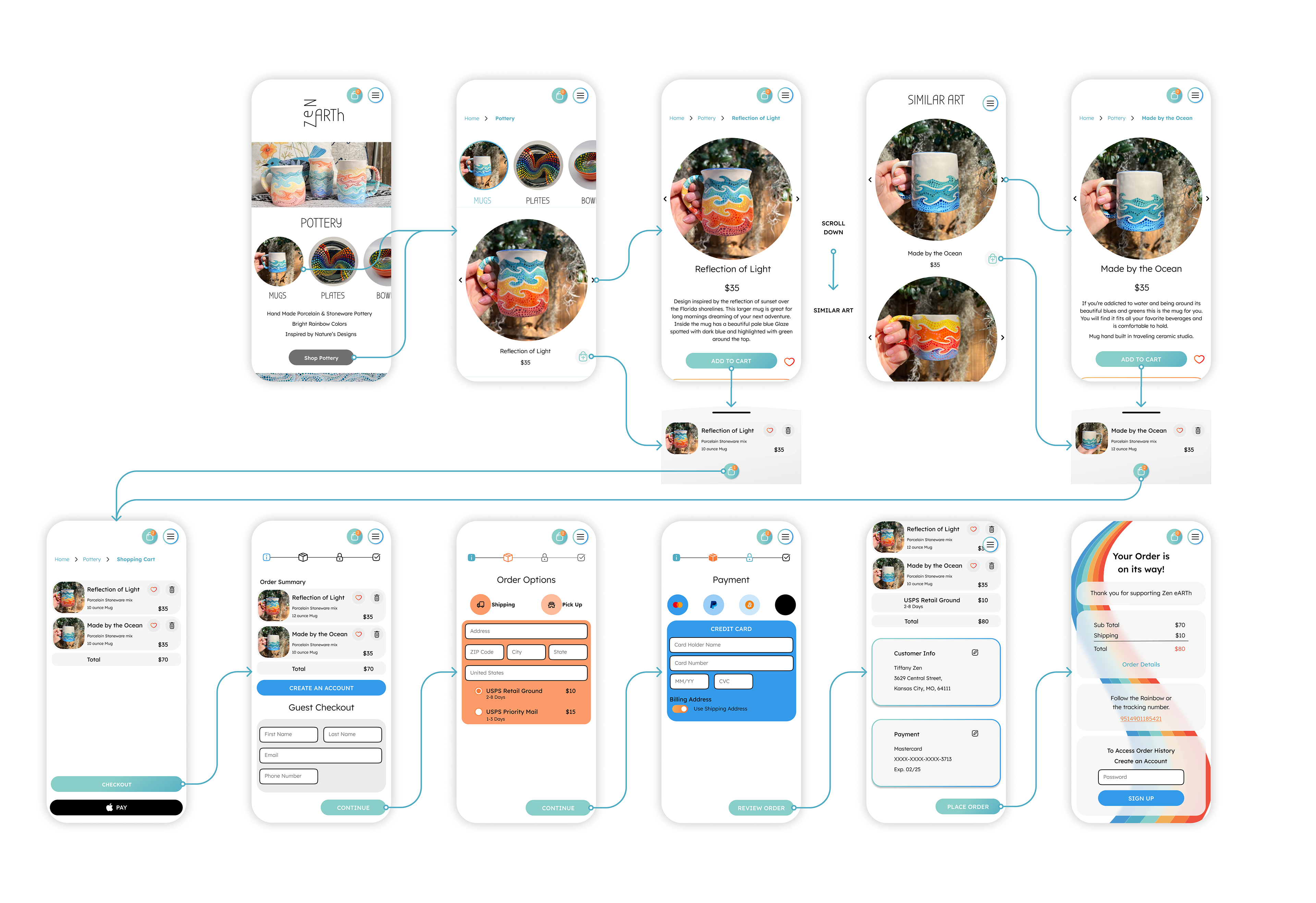
Prototyping an E-Commerce Flow
I found this to be my most enjoyable part of designing. This is where I feel a lot of users will have frustrations with a website or app based on the timing and motion. I wanted to make it easy to follow with the most understandable transitions and least amount of movement.
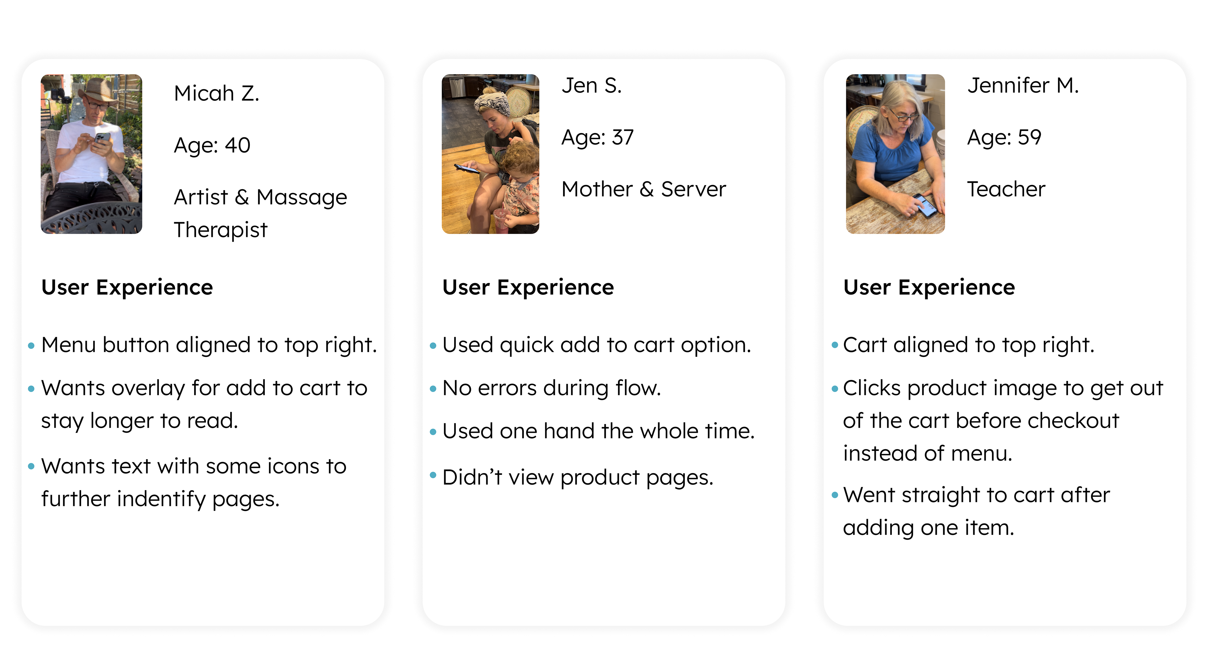
User Testing
During the user testing phase, I tested the mobile prototype with different age groups, lifestyles, and genders. In doing this, I got different feedback for similar elements within the websites and how the user would like to see the website perform.
Final Design and Prototype
After testing was complete, I was able to make revisions that will help the end user and have been proven successful on the second round of testing. If you would like to test the prototype or view it, you can contact me directly for a link.
What I have learned
Redesigning ZEN eARTh website has taught me that alignment and spacing are the key to a happy user experience. The less eye movement and remembering the user has to do helps them to finish the flow easily.
Color is an important tool to guide and reinforce the user’s discussions along with making it an enjoyable experience.
Prototyping your design is the easiest way to reveal alignment issues across pages and to see how the micro animations and transitions would feel in real-time.
Future me
I am continuing my education in Figma and focusing on micro animations, advanced prototyping, and design systems. I will also be studying Adobe After Effects to add some more detailed animation.
I am going to code my website to have an understanding of the developer's process and how to communicate with them. I have started a Figma to Webflow course. Check back in to see when the website goes live.

